DESIGN & DIGITAL
TRANSFORMATION LEADER
I help organizations navigate moments of change by aligning business, brand, technology and experience into solutions people understand, trust and adopt.
Over the past two decades, I have partnered with global organizations to modernize platforms, redefine customer experiences and lead digital transformation initiatives across North America and Latin America.
My work combines strategic thinking, creative leadership and systems design to turn complexity into clarity and ambitious ideas into practical outcomes.
Helping organizations navigate moments of change
Every organization reaches moments when the old way of working is no longer enough.
Sometimes it is a rebrand. Sometimes it is a new platform, an acquisition, a regional transformation or a shift in customer expectations.
Throughout my career, I have helped organizations move through those moments by connecting business goals, technology and design into experiences that create clarity, alignment and momentum.
That perspective continues to shape the way I lead teams, build digital products and approach complex challenges today.


Experience Transformation Projects
These projects illustrate a consistent approach to solving complex business challenges through design, research and collaboration.
From enterprise modernization and service design to customer experience and digital transformation, each case reflects how strategy, systems thinking and multidisciplinary teams come together to create meaningful outcomes.
CASE STUDY 1
Transforming a Regional Airline into a World-Class Brand
Role: Digital Experience & Brand Design Lead
Responsible for the creative direction of the brand evolution across digital platforms, destination marketing, campaign development, visual identity systems, photography direction, content strategy, and customer experience initiatives.
Overview
For decades, Copa Airlines had built one of the most efficient route networks in the Americas.
The challenge was that very few people emotionally connected with the brand.
Customers knew Copa as an airline.
The opportunity was to reposition it as the airline that made the Americas feel connected.

About Copa Airlines
When this initiative began, Copa Airlines was entering one of the most important moments in its history.
Panama had become the natural connection point between North and South America through the Hub of the Americas®, giving the airline a competitive advantage that few carriers could replicate.
At the same time, the company was expanding internationally, modernizing its fleet, and preparing to join one of the world's largest airline networks.
The brand needed to evolve at the same speed as the business.
At the Time
- Founded in 1947
- Hub of the Americas® operating from Panama City
- Serving more than 60 destinations across North, Central and South America and the Caribbean
- Preparing for international expansion and a stronger global positioning
- Later became a member of Star Alliance (2012)
- Today operates more than 100 aircraft and consistently ranks among the world's most punctual airlines

The Challenge
Although Copa Airlines had built an exceptional operational reputation, its communication still reflected the language of a regional airline.
Most campaigns focused on schedules, fares and destinations.
The experience felt transactional.
As the company expanded internationally, it became clear that the brand needed to communicate something much bigger than flights.
It needed to communicate opportunity.

The Opportunity
Instead of promoting routes...
We could promote possibilities.
Instead of selling destinations...
We could celebrate the connections between people, cultures and businesses across the Americas.
The challenge became creating a brand platform capable of connecting every communication touchpoint under one simple idea.
The Strategy
Building a Brand Around Possibility
Together with multidisciplinary teams, we redefined how Copa Airlines expressed itself across every customer touchpoint.
The new communication platform centered around one idea:
"Es Posible" - "It's Possible"
This was more than a campaign.
It became the organizing principle behind the brand.
The concept allowed us to connect cities, cultures, business opportunities and travel experiences through a single emotional narrative.
The word "SI" embedded inside "poSIble" visually reinforced the idea that every destination represented a new opportunity waiting to happen.
My Contribution
I led and contributed to multiple initiatives including:
• Digital creative direction across destination experiences and campaign websites
• Brand communication strategy for digital channels
• Development of the new visual language and communication tone
• Creative direction for large-scale photography production across Panama using real Copa employees, aircraft and operational environments
• Design direction for destination marketing campaigns
• UX and visual direction for tourism microsites
• Development of launch campaigns supporting the new positioning
• Brand guideline evolution and implementation across digital touchpoints
• Creative support for Copa's 65th anniversary communications
• Collaboration with multidisciplinary teams across marketing, digital, production and executive leadership
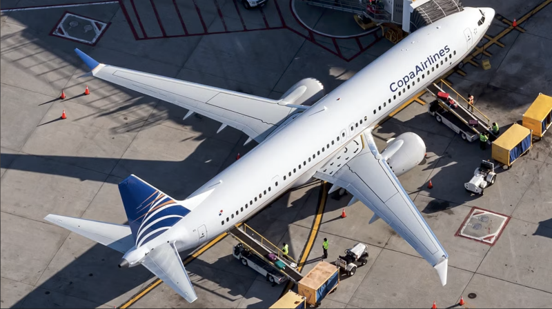
Photography
Creating an Authentic Visual Identity
Rather than relying on stock photography, we developed an entirely new visual library.
We directed original productions using Copa employees, aircraft, airport facilities and real operational environments.
The objective was authenticity.
Every image needed to reinforce trust, professionalism and warmth while presenting Copa as an international airline with a distinctly Latin American identity.
Digital Transformation
Reimagining the Digital Experience
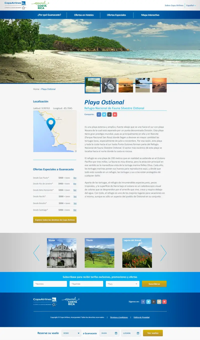
The website evolved from a transactional booking platform into a destination discovery experience.
Instead of simply listing flights, visitors could explore destinations, discover travel inspiration and understand how Panama connected the Americas.
Content architecture, storytelling and interaction design were aligned around the new brand platform.

Star Alliance
Supporting a Global Brand Evolution
As Copa Airlines continued its international expansion, the new communication system provided a stronger foundation for a global audience.
The work helped establish a more consistent brand language capable of supporting the airline's growing international presence, including its future integration into Star Alliance.

Results
Impact
• Established a unified communication platform adopted across campaigns, destinations and digital experiences
• Created a scalable visual language used across multiple channels
• Repositioned the brand from transactional airline communication toward emotional storytelling
• Strengthened consistency between advertising, digital products and brand communications
• Built an original photography library that replaced generic imagery
• Helped align marketing, digital and brand teams around a single narrative
Why This Matters
Many design projects improve interfaces.
Some improve brands.
Very few help reshape how an entire company tells its story.
This project wasn't about redesigning a website or launching another campaign.
It was about helping one of Latin America's fastest-growing airlines express the business it was becoming.
By aligning brand strategy, digital experiences, photography, storytelling and visual systems under a single idea, we created a foundation that could scale as Copa Airlines expanded across the Americas and onto the global stage.


CASE STUDY 2
Value Insights Platform
Simplifying a complex financial platform for faster decision making
Role: Experience Design Lead
Key skills:
- Research
- Experience Strategy
- Information Architecture
- Stakeholder Alignment
- Design Systems
- Enterprise UX
Overview
Financial consultants relied on a powerful platform that had grown increasingly complex over time. As new capabilities and AI-driven insights were introduced, navigation became fragmented and critical workflows became harder to complete.
The challenge was not adding new features, but bringing clarity, structure and consistency to an experience used to support high-value business decisions.
Challenges
The main issue was not visual. It was structural.
The platform had grown without a clear system behind it. Information was scattered, navigation was inconsistent, and users had to rely on experience rather than clarity to complete tasks.
This created friction in everyday use, especially for consultants working under time pressure.
At the same time, the platform relied heavily on financial data analysis, and new capabilities were being introduced using AI to support insights and recommendations. The experience needed to make that value clear and usable.

My Role
I led the design direction for the platform, working closely with designers, product stakeholders, and engineering teams.
My focus was to bring structure, clarity, and consistency to the experience, while making sure the platform could support more advanced capabilities, including AI-driven insights.
Approach
-
Understanding the real problem
-
We started by mapping the existing platform in detail.
-
Not just screens, but workflows, dependencies, and how users actually moved through the system.
-
We also spoke directly with consultants to understand where things were breaking down in real scenarios.
-
This helped us identify that the issue was not lack of features, but lack of structure.
-
-
Reframing the experience
-
Instead of redesigning screens, we focused on reorganizing the platform around how users think and work.
-
We simplified navigation, grouped related information, and reduced unnecessary steps in key flows like report generation.
-
The goal was to make the platform feel predictable and easier to use without requiring training.
-
-
Designing for data and AI-driven insights
-
A key part of the platform was the ability to generate insights from financial data.
-
We worked on how to present that information in a way that felt clear and actionable.
-
This included improving data visualization and defining how AI-generated insights would appear in the interface.
-
The intention was not to expose complexity, but to make the output understandable and useful in decision-making.
-
-
Aligning design and delivery
-
We developed wireframes and interactive prototypes to validate decisions early with stakeholders and engineering teams.
-
This helped reduce ambiguity and allowed for faster alignment before development.
-
We also created detailed design assets and documentation to support implementation and maintain consistency.
-


Key decisions
• Simplified the platform structure to reduce navigation complexity
• Reorganized workflows around user tasks instead of system logic
• Introduced clearer data visualization patterns for financial information
• Defined how AI-generated insights are presented to support decision-making
• Built a consistent foundation using the FORM Design System
Outcome
The redesigned platform made it easier for consultants to navigate, understand data, and generate reports.
Workflows became more direct, and users were able to complete tasks with less friction.
The improved structure also created a stronger foundation for future features, including the integration of AI-driven insights.
Beyond the interface, the project helped align teams around a clearer product direction, improving both usability and delivery.
Impact
The platform became easier to navigate and faster to use.
Consultants were able to generate reports with fewer steps and better clarity.
The improved structure also made it easier to introduce new features, including AI-driven insights, without adding more complexity.
CASE STUDY 3

Enterprise Platform Modernization
Role: Experience Design Lead
Key skills:
- Research
- Service Design
- Information Architecture
- Enterprise UX
- Design Systems
- Cross-functional Collaboration
Overview
Southern Company, one of the largest energy providers in the United States, needed to modernize its enterprise SaaS platform, a core tool used by corporate clients to monitor energy usage, manage efficiency programs, and generate operational insights.
The existing interface was functional but dated, fragmented, and difficult to scale. Users struggled with navigation, visual inconsistency, and inefficient workflows. My role was to lead the UX and UI redesign, bringing structure, scalability, and human-centered design to a complex system used daily by engineers, managers, and decision-makers.
Challenges
-
Fragmented user journeys. Multiple entry points led to redundant steps and lost context.
-
Inefficient workflows. Core tasks required navigating through multiple screens and unclear labels.
-
Inconsistent design. Each module had its own look and feel, resulting in cognitive friction.
-
Accessibility gaps. Limited contrast, poor responsiveness, and lack of keyboard support.
-
No scalable framework. Adding new modules required starting from scratch each time.

Approach & Process
Discovery & Research
-
Conducted stakeholder interviews and usability sessions with internal teams and external business clients.
-
Mapped task flows and pain points to identify friction in high-frequency actions.
-
Defined success metrics: time-to-task, satisfaction, and visual consistency.
Information Architecture
-
Reorganized complex menus into a clean, modular hierarchy.
-
Introduced clear navigation patterns based on user intent and context.
UI Design System
-
Developed a component-based framework for consistency and scalability.
-
Established visual hierarchy and accessibility compliance (WCAG 2.1 AA).
-
Designed responsive layouts optimized for field devices.
Prototyping & Testing
-
Built interactive prototypes for key workflows (reporting, analytics, alerts).
-
Conducted remote usability tests to validate flow efficiency and comprehension.
Collaboration & Delivery
-
Partnered with product owners and engineers for smooth handoff via Figma specs.
-
Documented reusable design patterns for future modules and features.

Impact
-
Reduction in task-completion steps by ~30% across core workflows.
-
Increased user satisfaction and adoption through improved usability and clear UI.
-
Established a scalable design foundation used for new modules and features.
-
Enhanced the platform’s ability to evolve and serve future customer needs with consistency and clarity.
Why It Matters
This project illustrates how enterprise UX design can transform complex systems into intuitive, scalable products. By bridging user needs, business objectives, and design execution, I helped Southern Company deliver a product that not only works effectively—but scales, adapts, and creates value.


CASE STUDY 4

ENSO | Scaling Service Design Across Global Teams
Role: Experience Design Lead
Key skills:
- Service Design
- Research
- Workshop Facilitation
- Product Strategy
- Feature Prioritization
- Prototyping
Overview
ENSO is a Service Design app developed to help facilitators plan, edit, and run Human-Centered Design workshops. The goal was to create a complete tool for design professionals and beginners alike, from setting up workshop information (date, agenda, audience) to managing activities and methodologies such as Form and Design Thinking.
Our team at Fjord Costa Rica (Formerly Accenture Song) received a third-release prototype from Accenture Interactive Amsterdam and was tasked with improving usability, visual design, and functionality to prepare Enso for global internal use within Accenture’s design community.
Challenges
-
Fragmented user experience between early prototype versions.
-
Lack of prioritization among new features for Release 3 and 4.
-
Limited user testing and unclear needs from design facilitators.
-
Missing consistency between mobile and desktop implementations.
Approach & Solutions
-
Research & Validation
-
Conducted usability tests and interviews with design experts to gather feedback.
-
Identified pain points and mapped unaddressed user needs.
-
-
Prioritization Framework
-
Organized enhancements and new features by impact and device on a shared roadmap.
-
Planned release cycles for continuous iteration.
-
-
UX & Feature Design
-
Redesigned workshop creation flows, templates, and activity libraries.
-
Added features such as Google login, Accenture SSO, facilitation mode, and custom activities.
-
-
Iteration & Prototyping
-
Validated improvements through Design Thinking sprints with stakeholders.
-
Tested Release 3 and 4 builds internally with multiple Fjord studios.
-
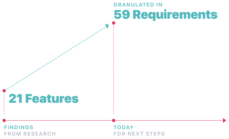
From Insights to Requirements
Through interviews, usability testing, and expert feedback from multiple Accenture studios, we identified 21 key features required to support real-world workshop facilitation.
These features were then granulated into 59 detailed requirements, covering functionality, usability, accessibility, and facilitation workflows.
This step allowed us to transform raw insights into a structured product roadmap, ensuring that every design decision aligned with how facilitators actually prepare, conduct, and evaluate their workshops.
Impact
-
Improved usability and feature adoption across Accenture’s design teams.
-
Introduced facilitation mode enhancements, enabling seamless live workshops.
-
Increased user engagement through simplified onboarding and creation flows.
-
Adopted by design teams in Stockholm and showcased at Equinox 2019 (Savannah, Georgia) as an internal innovation project

Why It Matters
ENSO became a valuable internal platform for Accenture’s global design network, empowering facilitators to focus on creativity rather than logistics.
The project demonstrated how iterative design, empathy, and collaboration can elevate internal tools into polished, user-friendly products that scale across organizations.
CASE STUDY 5
Brand Experience Transformation
Role: Experience & Visual Design Lead
Key skills:
- Brand Experience
- Customer Journeys
- Creative Direction
- Digital Strategy
- Motion
- UX
Overview
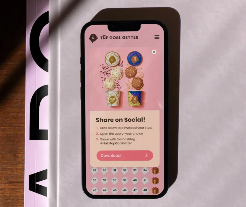
Halo Top, one of the fastest-growing ice-cream brands in North America, needed a fresh digital presence to reflect its playful identity while supporting e-commerce growth and audience engagement.
My challenge was to translate the brand’s quirky, guilt-free tone into an interactive digital experience that balanced storytelling, usability, and conversion.
The goal: build a web experience as delightful and light as the product itself.
Challenges
-
Fragmented brand voice: Existing campaigns lacked consistency across digital and social channels.
-
Flat user experience: The website didn’t express the product’s personality or flavor variety.
-
Low engagement metrics: Users interacted with visuals but not with the brand narrative.
-
E-commerce friction: Purchase flow and product discovery were not intuitive.
Approach & Solutions
-
Brand Immersion & Research
-
Analyzed audience behavior and emotional drivers behind “guilt-free indulgence.”
-
Defined tone, color psychology, and visual metaphors that evoke freshness and playfulness.
-
-
UX & Content Strategy
-
Re-structured navigation around moods and flavors, not just categories.
-
Simplified e-commerce flow with faster add-to-cart interactions and flavor previews.
-
Introduced playful micro-interactions to reinforce brand delight.
-
-
Visual Design & Storytelling
-
Designed an immersive hero animation where scoops and ingredients move in parallax.
-
Created responsive modules highlighting product nutrition, social campaigns, and sustainability.
-
Unified digital art direction across landing pages, emails, and social posts for a cohesive look.
-
-
Collaboration & Execution
-
Partnered with copywriters and motion designers to deliver cohesive brand storytelling.
-
Delivered high-fidelity prototypes and design guidelines for internal marketing teams.
-
Impact
-
Increased user engagement +60 % through interactive storytelling.
-
Improved e-commerce conversion rate by 27 % after redesign.
-
Strengthened brand consistency across global digital channels.
-
Helped position Halo Top as a modern, lifestyle-driven ice-cream brand.
Why It Matters
This project demonstrates how experience design and creative direction can shape emotional connections between users and brands.
By aligning design with identity, the Halo Top experience turned a simple purchase journey into a moment of joy, transforming visuals into a narrative that people could taste.